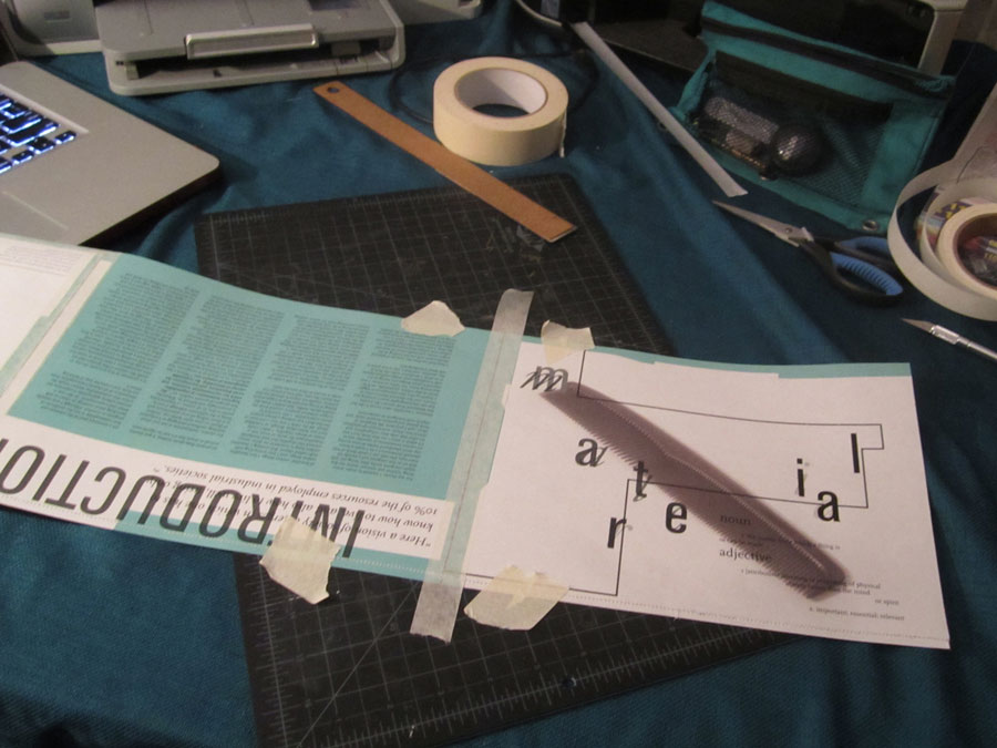
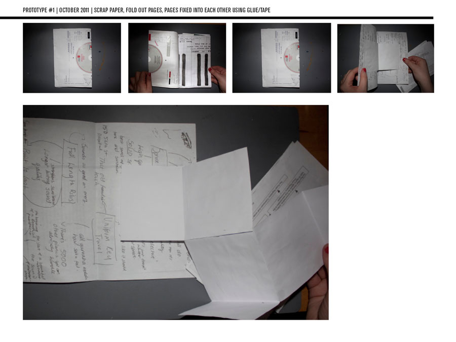
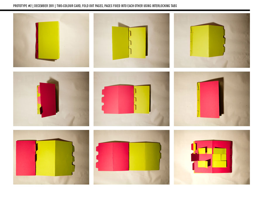
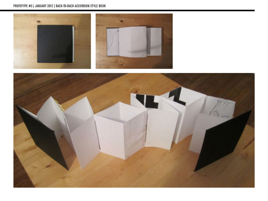
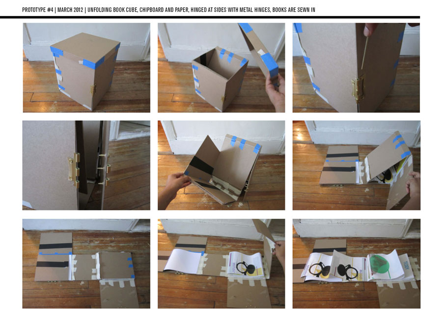
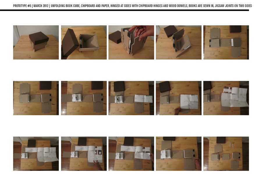
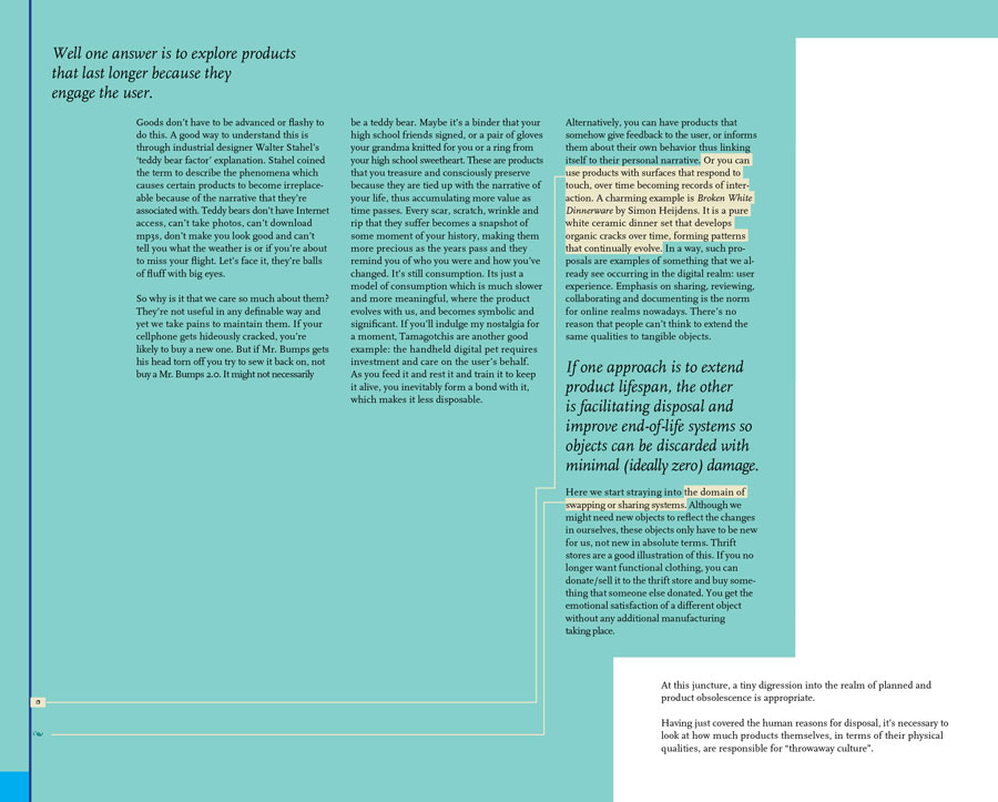
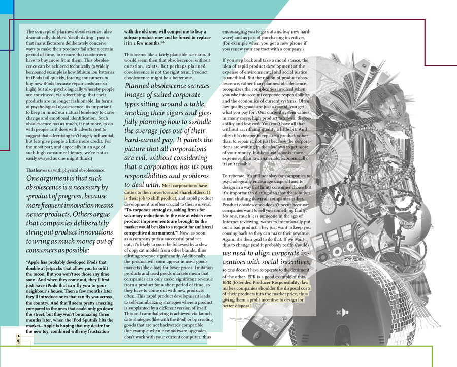
 The physical prototypes:
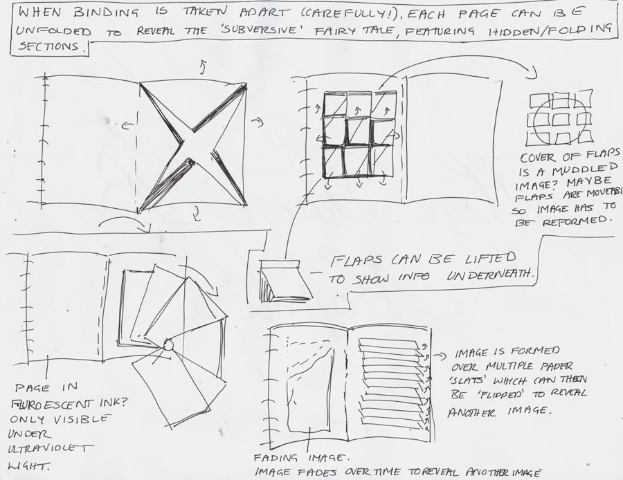
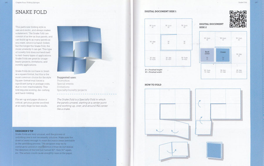
 The diagram idea for the final structure. From "Paper Folding Templates for Print Design" by Trish Witowski
Navigation The navigation for the project dealt with the visual system in place for connecting events from the story to the relevant spread. There were two sets of connections to be made:
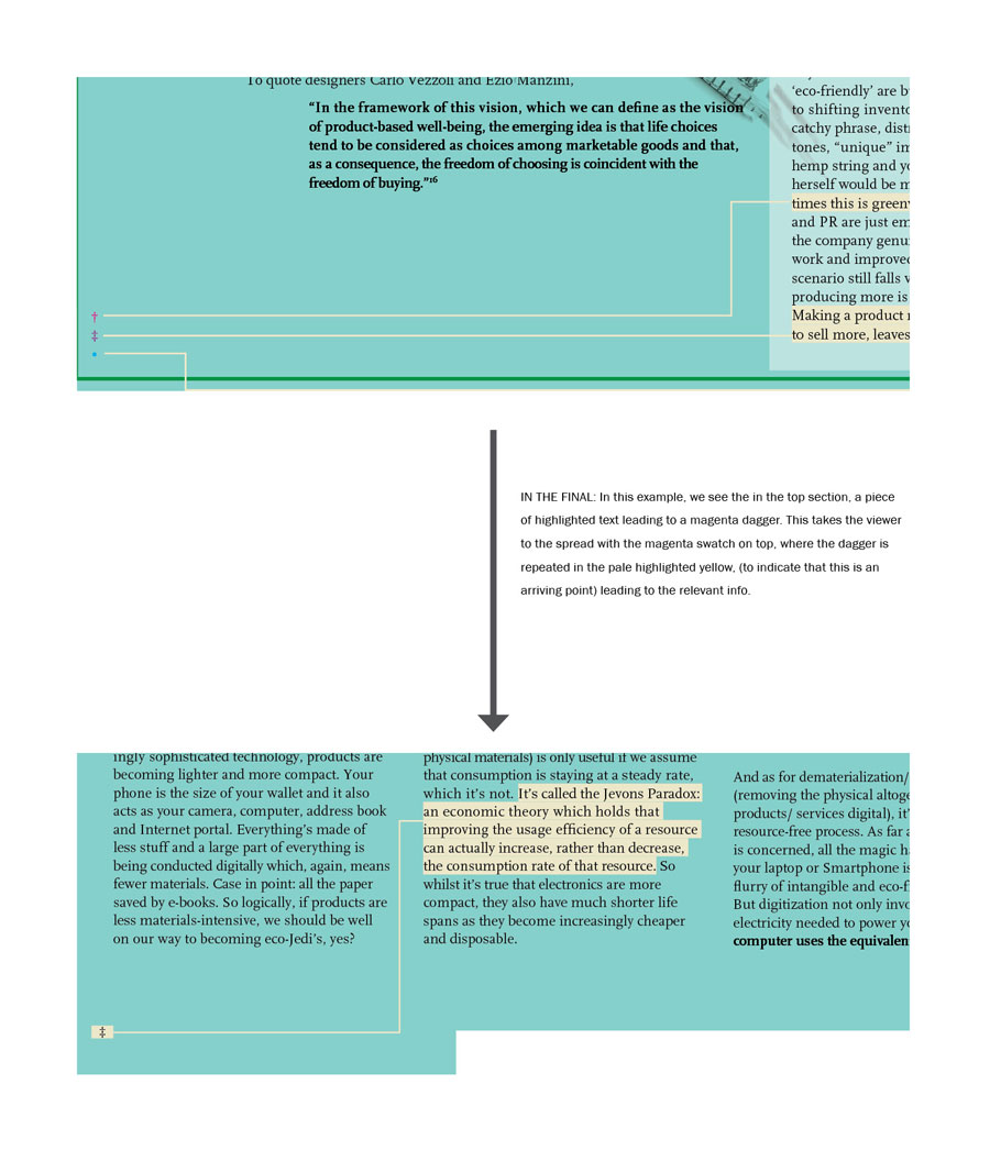
- Connections from events in the story to the information spreads
- Connections between different information spreads (known as interlinks)
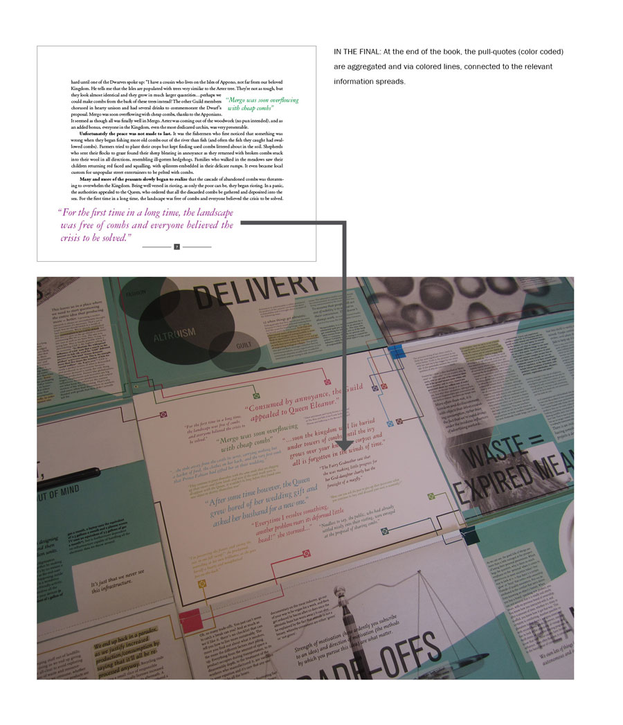 Connections between different information spreads (known as interlinks)
Based off the colored line system, it seemed to make sense to me to visually treat the interlinks in the same manner,
that is to have the interlink lines zip over the spreads to connect sections of text in different areas. However,
even though I muted out the color of the interlinks (down to a dull grey and later to a dull yellow) they turned into
visual clutter, especially since they needed arrows to indicate the direction of the connection. On top of this, because
of the fold outs within the information spreads, I had to re-calibrate the interlinks so that they made sense no matter
which pages were unfolded/ open. The sheer number of interlinking lines, and the fact that they had to be crowded into
the margins so as not to interrupt the body text, meant that they became very difficult to follow. During user testing,
viewers tended to ignore them completely because they were visually intimidating. As a solution, I eliminated most of
the interlinks by creating a symbol-based footnote system whereby any interlink would lead to the corner to the page
where a colored symbol would indicate the relevant spread to jump to. The symbol would then be repeated on the destination
page (in a different color scheme to indicate that this is an arrival point) and a line would lead off to the information
in question. In short, the interlinks still existed, but no longer had to span across multiple pages, which eliminated
much of the clutter.
Connections between different information spreads (known as interlinks)
Based off the colored line system, it seemed to make sense to me to visually treat the interlinks in the same manner,
that is to have the interlink lines zip over the spreads to connect sections of text in different areas. However,
even though I muted out the color of the interlinks (down to a dull grey and later to a dull yellow) they turned into
visual clutter, especially since they needed arrows to indicate the direction of the connection. On top of this, because
of the fold outs within the information spreads, I had to re-calibrate the interlinks so that they made sense no matter
which pages were unfolded/ open. The sheer number of interlinking lines, and the fact that they had to be crowded into
the margins so as not to interrupt the body text, meant that they became very difficult to follow. During user testing,
viewers tended to ignore them completely because they were visually intimidating. As a solution, I eliminated most of
the interlinks by creating a symbol-based footnote system whereby any interlink would lead to the corner to the page
where a colored symbol would indicate the relevant spread to jump to. The symbol would then be repeated on the destination
page (in a different color scheme to indicate that this is an arrival point) and a line would lead off to the information
in question. In short, the interlinks still existed, but no longer had to span across multiple pages, which eliminated
much of the clutter.
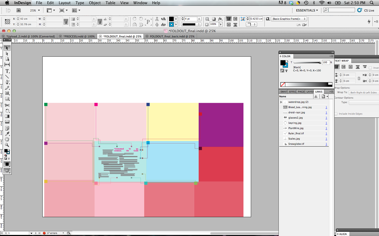
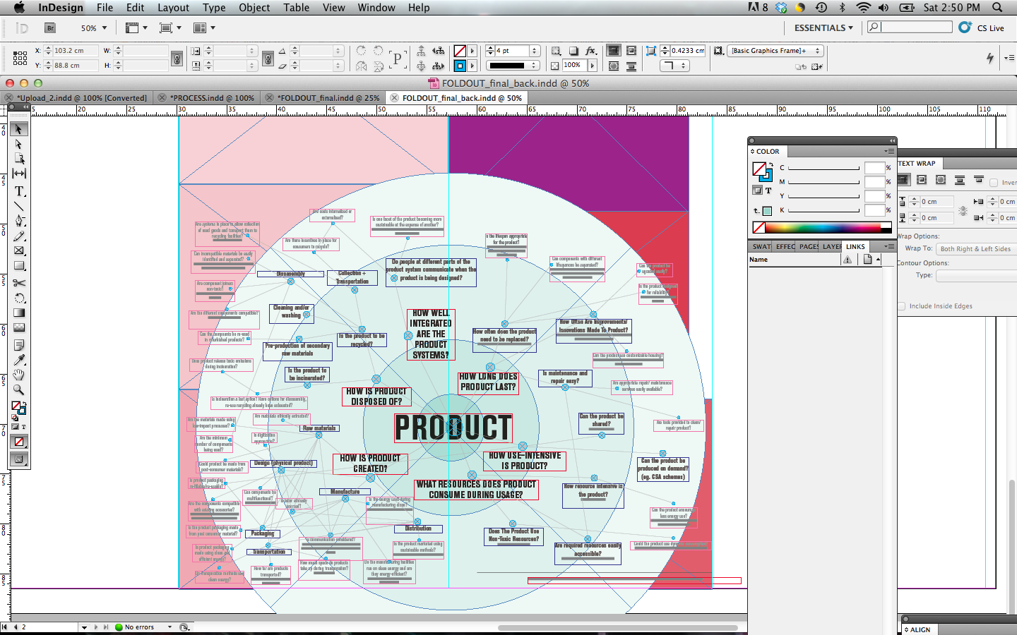
Digital Layout Screenshots showing the Indesign layout files used to assess alignment for the front and back of fully unfolded spiral.
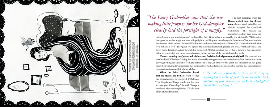
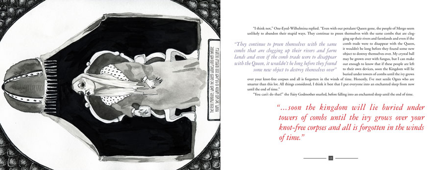
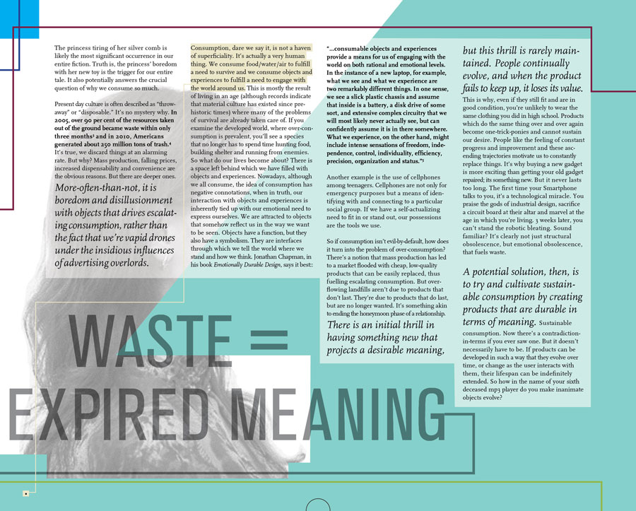
 Examples of digital finals of sections of the fairy tale and the information spreads
Production